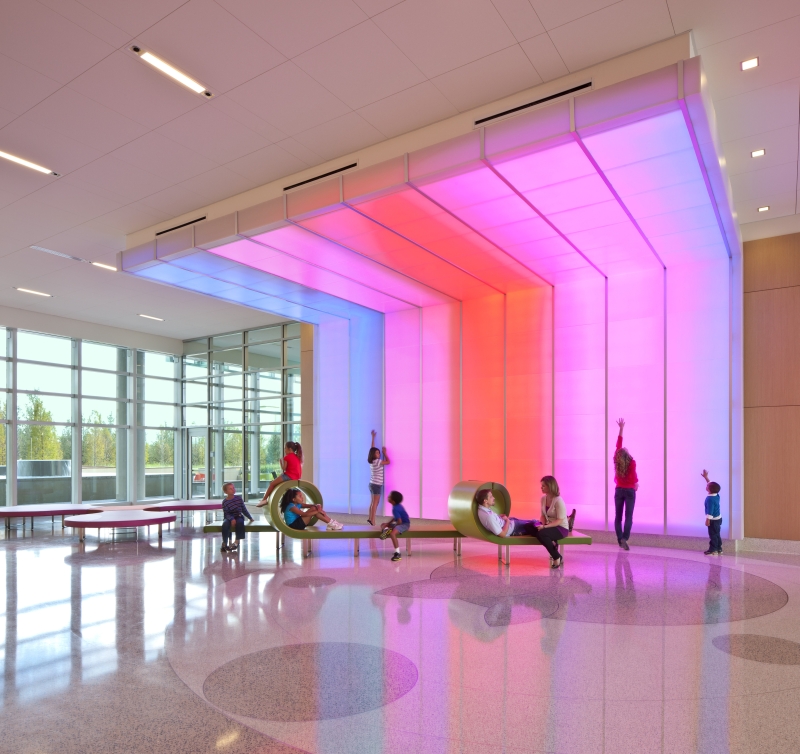
 Nemour's Orlando Children's Hospital. Photography by Jonathan Hillyer.
Design elements that consider a diverse population of users make lives better. When it comes to wayfinding, some factors will remain consistent – including accessibility and legibility. At Page, our design philosophy encourages planners to go beyond these typical notions to provide unique, more inclusive environments.
Universal accessibility is a relatively new trend, evolving from the 1990 Americans with Disabilities Act. This civil rights law prohibits discrimination based on disability and requires all businesses to have ADA Compliant Wayfinding signs. Rethinking universal design as “design for all,” creates functional and aesthetically pleasing innovations that transcend this baseline of universality.
A variety of users benefit from universal accessibility – including people with mobility, vision, hearing, or sensory impairments. Accommodations may also serve the elderly, those with temporary injuries or medical conditions, young families, and culturally and linguistically diverse people.
Innovative Wayfinding: Extending Cultural Inclusivity
The common saying, “A picture is worth a thousand words,” is omnipresent in wayfinding. Pictograms are more universally understood, as users’ native languages vary. Color association and images can widen comprehension, allowing for easier navigation to restrooms, more immediate access to emergency services, and more intuitive routing throughout a building.
Easy navigation is especially pertinent in facilities such as air terminals as people from all different cultures frequently engage with these settings. At the Austin-Bergstrom International Airport Terminal, Page designed a crescent-shaped organization that is simple and direct, providing easy orientation to passengers and the public. Walking distances are minimized while maximizing the visibility of the large, central marketplace adjacent to the gate areas.
Page also incorporated architecture and design into the terminal’s wayfinding system. The hall serves as a circulation hub and a point of guidance that draws passengers in from drop-off and ticketing areas and directs them out to gates. Colored glass redirects those who may be disoriented after passing through security.
Emerging Considerations
Gender inclusivity is an emerging conversation in universal design, ranging from conservative to progressive approaches. A more progressive facility may include a toilet sign to indicate restrooms, while a more conservative location may opt for a combined male and female pictogram.
There are also innovative ways to incorporate accommodations for the visually impaired. Alternatives to braille may lean into the senses of smell and sound. Acoustic wayfinding involves using a variety of auditory cues to create a mental map of the surrounding environment. Directions may indicate turning left when one hears a bird chirping sound.
As mental health awareness rises, designers often consider the headspace of those entering an environment. Providing information at crucial decision points, rather than locations ahead, decreases anxiety. Though common to healthcare settings, these elements are used in many locations. At George Mason University, Page designed the Fuse computing center with transparency, openness, and connectivity to create a welcoming atmosphere. Corridors incorporate clear sight lines with scaled directories.
Wayfinding designers also consider the age of users. Commonly, signs with large print and lower mounting heights will assist the older population, but how do you accommodate for children?

Children’s engagement with their environment is vastly different from adults. So, in a pediatric healthcare facility, cheerful, playful illustrations that use vibrant colors can help distract from the medical environment and assist children who may be unable to read.
At Nemours Children’s Hospital, Page integrated environmental graphic design with architecture and interior design, resulting in a seamless experience of the built environment and intuitive wayfinding. The graphic repetition of colors and forms contributes to a memorable sense of place, while architectural and landscape features add a playful touch. This award-winning design enriches both interior and exterior spaces while showcasing uniquely family-focused inpatient programs.
At Page, we create environments suitable for all its users, innovating new methods with each additional project. Universal design prioritizes users’ experience in a space, while maintaining equality and independence.
