In the world of interior design, creating spaces that perform as beautifully as they inspire is no small feat. For Kris Walsh, RID, LEED, Principal, and Interior Design Director at Page, this balance has been the cornerstone of a career that spans coast to coast—from law firms in Portland, Maine, to innovative corporate spaces in New York City, Los Angeles, and the Home of PGA of America near Dallas, Texas. With a career ignited by the encouragement of a college friend and shaped by influential mentors, Walsh's journey is a testament to trusting one's instincts and embracing transformative opportunities. In this interview, she shares insights into her design philosophy, reflecting on the power of performance-based design and the lasting impact of spaces thoughtfully crafted to meet the evolving needs of their users. Most recently, she was honored with the Leadership Award of Excellence at the International Interior Design (IIDA) annual Leaders Breakfast. She walked away with a legendary Eames stool as her award—a fitting tribute to her unwavering passion for design that both performs and inspires.

(This interview was edited for length and clarity.)
1. What inspired you to pursue a career in design?
Interior design wasn’t on my radar at first. I began at the University of Texas in the Education Department but quickly realized it wasn’t the right fit. A close friend noticed my fascination with floor plans and suggested I try an interior design course. The moment I stepped into the design studio, I was hooked.
During college, I was fortunate to work with two incredible mentors—an interior designer and an architect. As their sole employee, I gained hands-on experience in every aspect of the business. After graduation, I moved to New York, determined to join Gensler. Though I was advised to get more experience first, I persisted and, two years later, landed a role there. Working near senior partners felt like a "master’s degree" in real-time. I took on projects others didn’t want, like designing a law firm in Maine, which helped me build my skills and confidence. Those early experiences laid the foundation for my career.
2. Was that project in Maine a highlight of your time in New York regarding moving you forward as a designer and or understanding the importance of user-centered design?
Designing the law firm in Portland, Maine, was pivotal for me—it was my first project from start to finish. It taught me the value of building genuine relationships with clients, understanding who they are beyond just the technical aspects of design. Initially reserved, the client opened up, and by the end, we were enjoying lobster rolls for dinner at historic lighthouses.
This project was about transforming a traditional, old-school office into a modern, functional space that changed how the firm worked and interacted. Understanding that clients often spend long hours in these environments, I learned to prioritize comfort and practicality—like ensuring that a sofa could double as a place to rest. It was a crash course in balancing aesthetic goals with real-world needs, refining my approach to communication and problem-solving.
3. Can you share an example where you identified and addressed an unarticulated user need that unexpectedly transformed someone's approach to a project?
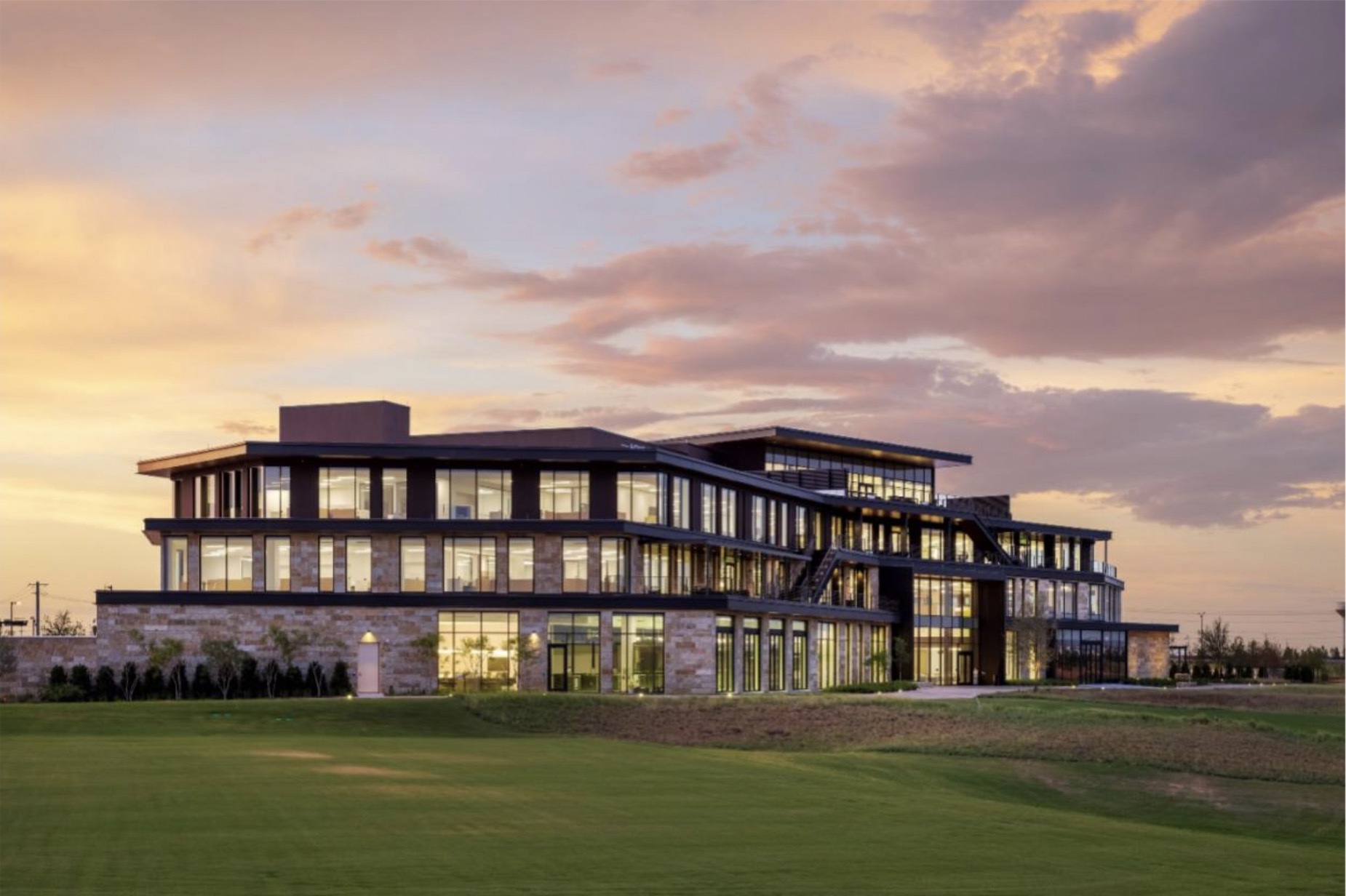
One standout project was the PGA of America headquarters. Due to the ground-floor production studio’s high ceilings, the space above had an unusual section with low headroom. Instead of turning it into storage, we reimagined it as a collaborative social platform. Placing the IT help desk nearby added functionality, making it a flexible area for support and teamwork.
We emphasized adaptability by using all-furniture solutions and demountable walls throughout the building. This modularity allowed spaces to be easily reconfigured as needs change. The platform, including a loosely defined "conference room," remains versatile, proving that thoughtful design can sustain evolving without permanent structures.
4. As an interior designer, what’s a common interior design mistake that’s easily overcome with well-thought solutions?
This may seem like a simple answer, but space planners often overlook the three-dimensional aspect of a space. They'll look at floor plans and place walls or partitions without fully considering how they impact not just the flow of the space but also its long-term flexibility.
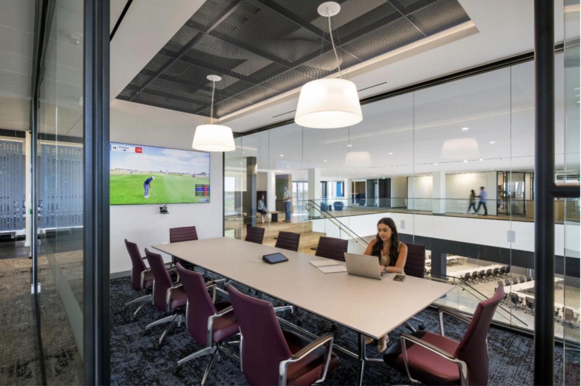
For example, when we designed the office areas, the typical approach would have been to use permanent walls, glass, and wood doors. Instead, we introduced demountable wall systems with the infrastructure to support them. This way, the walls can be easily removed or moved without significant disruption if the space needs to be adapted in the future—whether by adding more workstations or reconfiguring the layout.
To me, space planning with flexibility in mind means going beyond just saying, "It's flexible." It asks, "What does flexibility look like here?" and then providing examples and testing those ideas with the client. We make sure to ask, “Would this approach be useful for you in the future?” It's worth the time upfront to explore these options before clients commit to traditional construction solutions, which often come with higher costs and less adaptability.
5. When thinking about the PGA of America project, how did you balance the building's prominence with its integration into the surrounding environment? I assume the exterior design impacted the interior layout and experience.
Absolutely. Since the landscape was still being designed, we didn’t have a clear picture of what it would ultimately look like from the outset, but we understood the building’s prominence in the environment. That’s a great way to frame it: the building is, in a sense, a servant to the landscape.
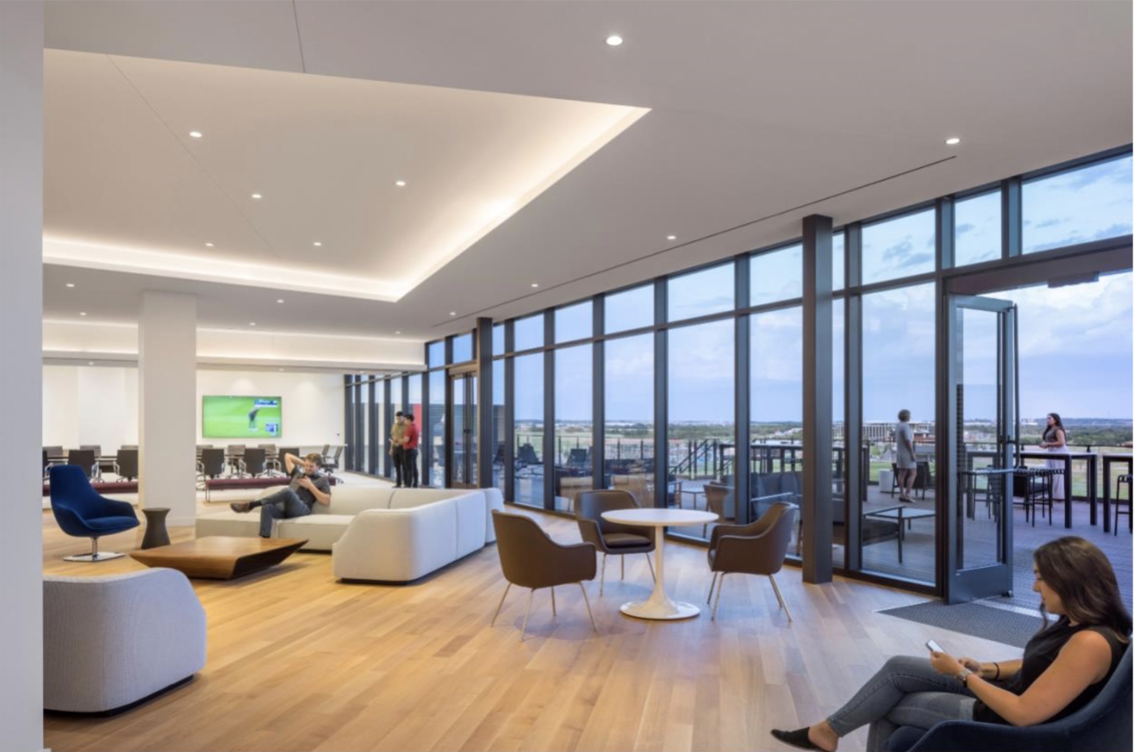
Each floor features an outdoor terrace on the side facing the course. These aren’t just decorative; they’re fully functional spaces with seating, power, and data connections. The facade facing the course is intentionally kept open—no private offices, workstations, or conference rooms are placed there. It’s always a brief collaborative zone. There may be a few chairs or a table here and there, but the idea is to create a space where natural light and the view become shared amenities for everyone inside.
Even how we treated the building’s corners was important—we avoided solid elements there, opting instead for transparent, open corners to enhance that connection to the outside. We considered both long and short views, always maintaining a strong visual link to the landscape.
We strive for this kind of integration in every project, but it was especially studied in the PGA of America project. We paid particular attention to how the building looked from the outside, especially at night or during dusk and dawn. We were very conscious of the transparency of the building’s facade, considering how much of the interior could be seen from the outside and how permeable that elevation was.
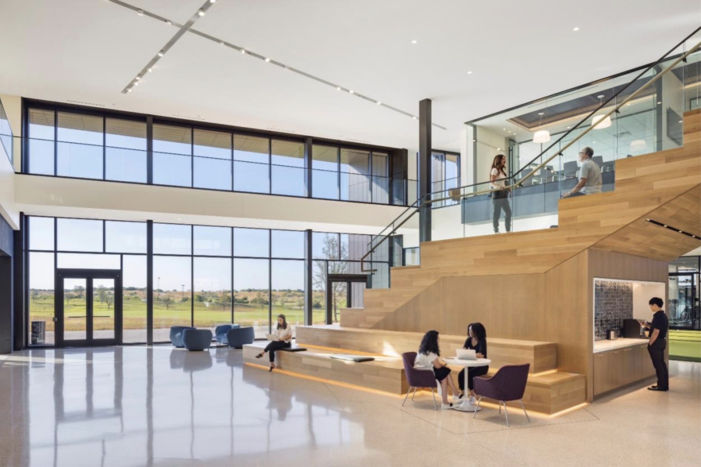
The color palette inside the building reflected the dusk-to-dawn theme. While some bold colors are in the space, they are all grounded in natural tones, reflecting that inspiration. This concept influenced every design decision we made.
6. How did you integrate educational and interactive technology, like the hitting bay, into the building's design to ensure technological features feel cohesive rather than separate or harsh?
Typically, instructional spaces are very compartmentalized, with solid walls creating enclosed bays. You step into a small, isolated area, often with a net or a monitor on the wall. We wanted something different. Instead of traditional solid walls, we used perforated steel and metal screens to create the bays. These screens allowed for openness and visual connection between spaces. Even when a monitor was mounted on the screen, there was a sense of porosity—you could see and hear the person next to you, but it didn’t create a sense of enclosure.
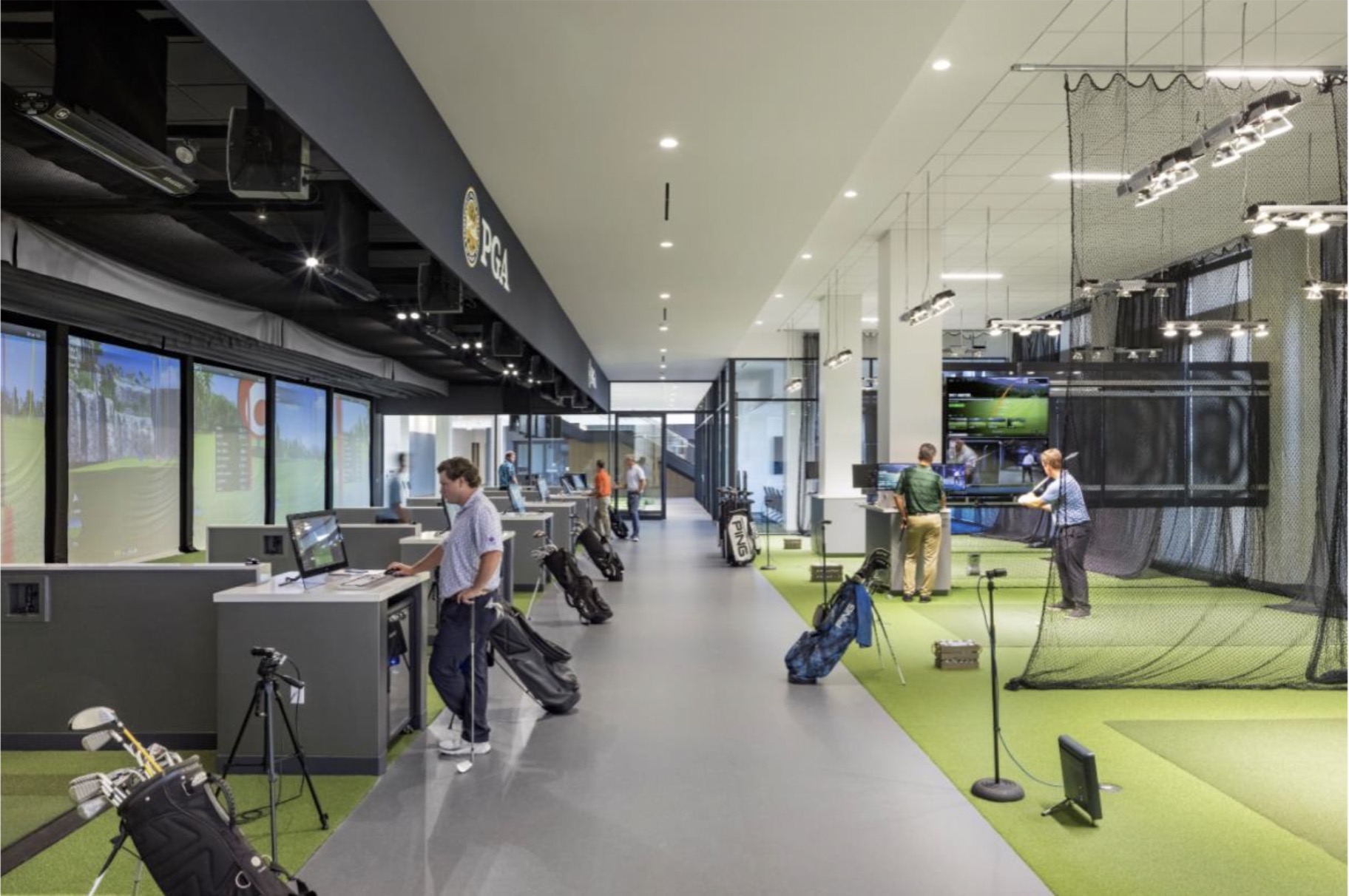
The technology within each bay was integrated into the space, but we ensured there was still a visual connection to the surrounding areas, such as the club performance room where custom clubs are made.
One element we love to incorporate in projects like the PGA of America is the sense of surprise and discovery. Perforated screens, for example, appear more solid from the front door, but as you move through the space, they reveal a more open, dynamic quality. Using materials that shift in appearance depending on your perspective was a key design choice—and it has worked really well in the hitting bays, blending functionality with an unexpected visual experience.
There’s something unique about that space, especially when everything aligns—the right day, the wind in the right direction. Because of the porosity in the design, you get this incredible sensory experience. All this advanced technology surrounds you, yet it feels like you’re as close as possible to being out on the course. It's a rare and immersive experience combining the best of both worlds—the high-tech environment and the natural, open feel of the outdoors. That’s what makes it so unique.
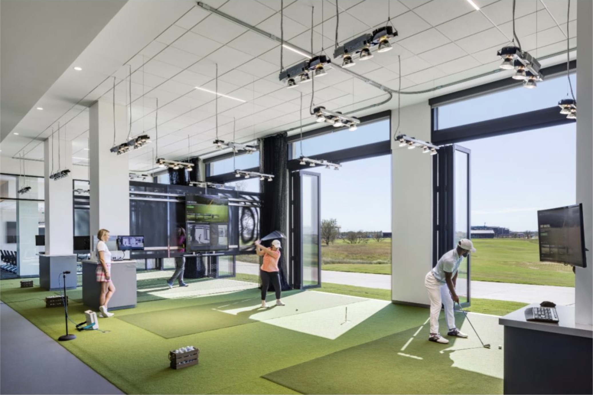
It’s that feeling of being in a built environment but still sensing the breeze or the wind. It adds another layer, making the space feel more authentic and grounded in reality. It’s those small details that make the experience more memorable and more authentic to life.
Jennifer Wegner, a contributor to this story, is the Editorial Manager at Page.
